

Designed with:

Role
UX/UI Designer
Timeline
Three weeks, 2018
during the Total Expert platform redesign
Team
Product Manager, Design Manager, Tech Leads
Jump to Section
Choose Section to Jump
Quick Links
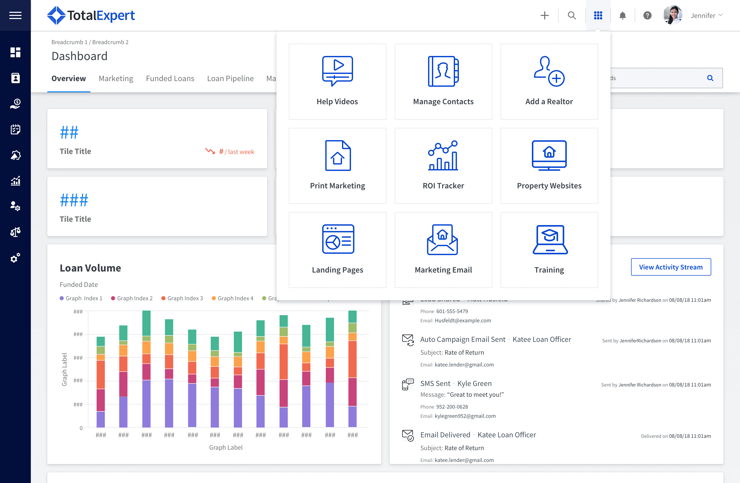
a grid of shortcuts an organization could configure for its users.
Total Expert exists because of the 2008 housing crisis. When new regulations landed on how real estate agents and mortgage lenders could market together, the company built a compliance-safe way to do it. That worked. The product grew into a CRM, then a marketing platform, then a system that eight of America's fifteen largest lenders ran their business on.
It grew on WordPress. It grew fast. And it grew without a design strategy.
By 2018 the platform had 94 unique navigation links spread across 126 user roles, nested up to five levels deep.
Quick Links was a workaround. When navigation gets hard enough to use, someone eventually builds a shortcut past it, and the shortcut becomes part of the product.


Competitors were closing on feature parity. Leadership's read was that design and usability were the next place to compete, and a platform-wide redesign began.
Quick Links came to me with three weeks and a question:
Should this feature exist at all?
Underneath it were three more:

Do we need Quick Links if the left navigation actually works?
Would users rather set their own links rather than have an organization set them?
What if they lived in the global header instead of the dashboard?
That annotation is the whole problem in one frame. Quick Links existed to save users time, and they sat below the fold, on one page, reachable only after scrolling past everything else.
One constraint shaped this entire project: senior leadership had determined that users were not available for research.
So I built understanding from what I could reach.
Analytics
which I threw out.
I mined Google Analytics for Quick Links usage and found the data was contaminated. Internal IP addresses had never been excluded, so our own team's traffic was mixed into every number. I couldn't separate customer behavior from ours, so I stopped using it rather than build on numbers I didn't trust.
Cord Sorting
The product manager ran a card sorting exercise with five internal stakeholders across all 94 navigation items, and I participated as the designer. The finding that mattered: for loan officers, the primary user, everything ranked below maintaining and nourishing contact relationships. That became the organizing principle for the whole navigation effort.
Research Survey
We received a narrow exception that allowed research.
Privacy constraints capped the list at 28 recipients. I wrote nine questions because I wanted responses more than I wanted data. The survey ran two weeks.
Why These Questions?
The design of it mattered.
Question two asked how often people used Quick Links instead of the side navigation, with a free-text "if never, why not?" so a negative answer still produced a reason.
Question five tested the customization hypothesis directly.
Question nine asked people to rate their own computer skills, so I could tell whether an answer came from someone comfortable in software or someone struggling with it.

Every voice pointed the same direction: the organization was curating shortcuts for people who did not want them curated.
3 of 28
recipients responded
Three responses is not a sample
It is an anecdote. But it was the first direct user input this project had been allowed.
All three said they…
never used Quick Links —
they navigated with the left sidebar instead.
would want to set their own if they could.
Simplifying the Design
Move Quick Links off the dashboard
Create a persistent control in the global header using the Google Apps grid metaphor people already knew from another product
Keep the icons
Let users set their own links
Cheap to build. Familiar.
Available from every page instead of one.
It gave users the thing they asked for.
que ominous music
Organizations were not willing to give up global control of Quick Links. Some had twelve configured. Some wanted twenty.
That broke the design I had just validated. A nine-tile icon grid does not hold twenty items, and a growing icon set is a maintenance cost the team carries forever, one new illustration at a time.
The user research and the business requirement pointed in opposite directions, and I had three weeks to build something that served both.
I dropped the icons
They were a genuine visual cue, and losing them cost real scannability. They were also unsustainable at twenty items and expensive to maintain indefinitely. Between a cue that worked at nine and a system that worked at twenty, I took the system.
I replaced the scanning mechanism rather than removing it
Losing icons meant losing the ability to find something at a glance, so I alphabetized the list. Alphabetical ordering is instantly learnable, requires no training, and is fast when you already know what you want. I also highlighted the current page in the list when applicable, so the control told you where you were as well as where you could go.

I kept the global header placement
This was the part users actually needed, and it was the part that survived both turns: access from every page rather than one.
I phased it honestly
Organization-controlled links shipped first, because that was what organizations required and what could be built in the time available. User customization was designed and scoped as Phase 2: personal Quick Links listed above organization ones, a remove control on hover, and a visible slot counter so people knew how much room they had left.
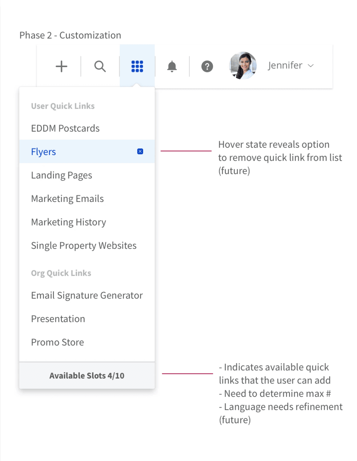
Phase 2 was a promise, not a shipped feature. I documented it as a stop-gap rather than presenting Phase 1 as complete.

I presented to product managers and tech leads. They took the simplicity of it, and Quick Links moved to the global header as part of the broader redesign rollout.
Still in use
It is still there. Open Total Expert today and the grid icon sits in the global header between the add button and the help icon, seven years after I designed it, documented in Total Expert's own help center under "How to Access My Quick Links."

What shipped
and what didn't
Shipped
the global header placement, the grid metaphor, the dropdown pattern, and access from every page.
Didn't ship
the alphabetized ordering. The current list is ordered by the organization, not alphabetically. The placement solved the access problem; the scanning problem I tried to solve with alphabetization is still open.
Never built
Phase 2 user customization. The thing all three survey respondents actually asked for is the thing that didn't get made.
I'd fight the sample size instead of accepting it.
Three responses out of 28 was treated as directional and labeled as such, which was the honest handling. But I accepted the privacy cap as final rather than proposing alternatives, and there were alternatives: routing through customer success managers, in-app intercepts, or interviewing the CSMs who spoke to these users daily. I now treat research access as something to negotiate rather than something granted.
I'd validate the replacement, not just the removal.
I had evidence that icons were unsustainable. I had no evidence that alphabetization would work as a substitute. I reasoned my way to it. Given the outcome, that instinct deserved a test.
Resolve the recurring-task overlap question
One of the open questions in the task flow sidebar was: what happens if a recurring task's previous instance hasn't completed before the next one fires? I flagged it but the issue was never resolved. I would have liked to work with development on this issue further to get a better understanding of the kind of issues is type of conundrum could cause for the system and whether it was a bug that needed to be fixed immediately.
Asking whether the feature should exist before asking how to improve it. Every version of this project that started from "make Quick Links better" would have produced a nicer grid in the same wrong place. The answer to the first question is what moved it.
